

The OSS Golf Analogy
Over the years, I’ve often referred to The Corkscrew Analogy or Momentum Spiral to describe a mindset of incremental improvement that’s needed to keep an
The first OSS/BSS I used, back in 2000, was built around an Oracle relational database and the GUI was built using Oracle Forms (as well as some C++ apps). The developers had implemented a concept they referred to as a boilerplate. It basically allowed the customers to modify any label they wished on the forms.
When I say labels, I mean any of the default text fields, such as the following in the diagram below:

By default, the forms in my first OSS were all written in English. But the boilerplate functionality offered the customer flexibility. Instead of “connecting links,” they may’ve preferred to call it “cross-connects” or “enlaces de conexión.” It was perfect for supporting different languages without changing the code. At the time, I thought this was a really neat feature. It was the first sign I’d seen of codeless flexibility in the UI of an OSS.
These days, most OSS/BSS need drastic improvements in their UI. As we described previously, they tend to be non-intuitive and take too long to master. We need to go further than boilerplate functionality. This is where headless or decoupled architectures appear to hold some promise. But we’ll loop back to the how in a moment. First, we’ll take a look at the why.
Apple has shown the tech world the importance of customer experience (CX) and elegant UI / industrial design. Much like the contrast between the iPod and previous MP3 players, our OSS/BSS are anonymous, poorly made objects. We have some catching up to do.
But, let’s first start by asking who is the customer we’re designing a Customer Experience for? Well, there are two distinct categories of customer that we have to design our OSS/BSS and workflows for, as shown in the sample Order to Cash (O2C) flow infographic below.

The end users need to have a CX that appears highly integrated, smooth and seamless. It has to appear consistent, even though there are multiple channels that often aren’t linked (or even linkable – eg a customer might interact with an IVR or chatbot without revealing personal identifiers that can be linked with a customer ID in the OSS/BSS).
The end user follows the journey through the left-hand column of the infographic from start to finish. However, to deliver upon the flow on the right-side of the infographic, the CSP side, it’s likely that dozens of operators using many completely unrelated applications / UIs will perform disparate activities. They’ll perform a small subset of activities, but for many different end-users within a given day. It’s highly unlikely that there will be a single person (right side) mirroring the end-user journey (left side), so CSPs have to hope their workflows, data flows and operators all work in unison, without any fall-outs along the way.
Along the right-hand path, the operators tend to have a plethora of different back-end tools (as implied in the comments in the O2C flow above). They might be integrated (via API), but the tools often come from different vendors, so there is no consistency in UI.
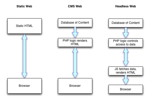
The “headless” approach (see article from pantheon.io for further info), allows the user interface to be decoupled from the application logic and data (as per the diagram below). If all the OSS/BSS tools along the right-hand path of the O2C infographic were headless, it might allow an integrator to design a smooth, consistent and robust end-to-end customer experience across many different vendor applications.
A few other thoughts too:
Hat tip to George for the headless UI concept as a means of improving UX!
PS. I should also point out that another parallel universe I’m diving into is Augmented Reality based OSS/BSS and it provides a slightly different context when mentioning headless UX. In AR, headless implies having no screen to interact with, so the UX comes from audio and visual presentation of data that diverges significantly from the OSS/BSS of today. Regardless, the separation of logic / data from the front-end that we described earlier also seems like a step towards future AR/VR-based OSS/BSS.

