Our Latest Product Release – Telecom Product & Service Mapping Guide
Every carrier knows it needs a clear product catalogue, with well-defined service and resource definitions. But it is not always obvious where to start. Across
No doubt all of you have seen network performance graphs. The one below is an example (from Flowmon 8.03). This example shows throughput, jitter and round-trip time amongst other metrics. No doubt you use many additional metrics to track the health of your network.

Most performance management tools show the range of metrics as line or bar graphs, as above, which is helpful of course. They often also have threshold-crossing alert capabilities. For example, if utilisation crosses a certain threshold (eg 70%), then send an alert to do something about it. Or even better, trigger an automation to do something about it.
The only problem of using this approach is that the discrete values you see are not telling the whole story. You’re generally seeing the averaged value for a given poll-cycle (eg 5 mins), not the fluctuations that appeared during the poll-cycle.
That got me thinking that candlestick charts might also show some useful information when visualising network performance. Candlesticks, such as the one shown below, are more often used for financial analysis.

They show the open and close (for a given recording period) in the thick body of the “candle” (red for a drop, green for a rise); as well as the high and low during the recording period in the candle wicks.
This gives you a much better feel for the fluctuations during a given recording period. However, in my many years in OSS/BSS, I’ve yet to see this technique used. Have you?
Whilst discussing the possible merits of this technique with a good friend and super-talented OSS/BSS developer, I was alerted to an additional concept – Bollinger Bands. Hat-tip Jay!
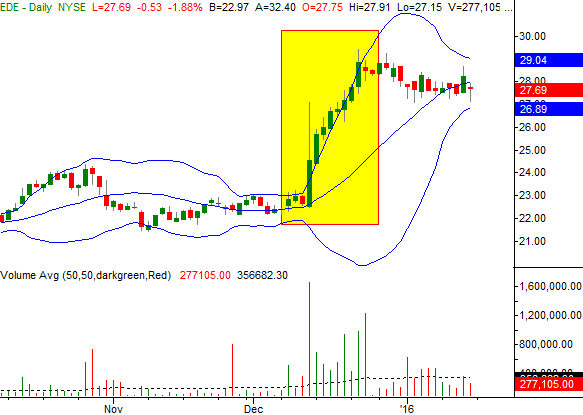
Bollinger Bands are also generally used in financial analysis. They are the lines marked in blue, overlaid onto the candlestick diagram below. They’re similar to moving average envelopes, but include standard deviations in their calculation. They’re useful because they identify periods of volatility such as the yellow box in the diagram below. The yellow box has identified abnormal behaviour well before a typical threshold-crossing event would have occurred, thus giving advanced warning.

Generally speaking, performance is tending towards upper limits when the candlestick is near the upper blue line and tending towards lower limits when near the lower blue line.
What do you think? Could candlesticks and Bollinger Bands help you keep your network within acceptable performance bounds?
BTW. Time can be an important factor for monitoring network health trending, especially since 5, 10 and 15 minute poll cycles are still common. Let’s say the start of the 15m poll cycle is at 00:00, so the EMS/NE performance for 15 mins to then logs the record at 00:15 (or perhaps later depending on its ETL efficiency – let’s say 00:20). The log then gets pulled and processed and visualised by a performance visualisation tool, which requires further time (let’s say 10 mins). So now it’s 00:30 before any person or system can react to what started happening 30 mins earlier. Most performance graphs just show the average value over each 15m poll period. If your EMS/NE can also export max and min during each period, you’ll have the ability to generate a candlestick. Then in turn you can generate your Bollinger Bands. It doesn’t speed up the delays mentioned above, but it will give you additional granularity on a single graph though.
Note: Candlesticks are similar to box plots, which are also used to show variability within time-series data. A box plot (aka box and whisker chart) shows:
Hat-tip to Jim for recommending box plots.

Every carrier knows it needs a clear product catalogue, with well-defined service and resource definitions. But it is not always obvious where to start. Across

After reading the book, How Big Things Get Done (by Bent Flyvbjerg and Dan Gardner) about why megaprojects fail, I found it fascinating that it
I have a really important question for you to ask yourself today. It’s a question that shapes a lot of our thinking about how I
I would have heard the phrase “your network is your net worth” early in my career and probably nodded along without really believing it (or