Stop the Archaeological Dig: Bringing Your OSS Dinosaur Back to Life
Are you worried that your OSS/BSS stack, or parts of it, might be in desperate need of an overhaul? Many OSS experts love being archaeologists,

Modern telco software roadmaps tend to be full of novel features.
But what if none of that novelty is enduring?
What if the silhouette of the Porsche 911 guides us on what should be included in our next OSS roadmap?
From article 1 in this series, The Lindy Effect tells us that the longer something non-perishable has survived, the longer it is likely to survive. In OSS/BSS, four domains have endured every platform shift for decades: Inventory, Fulfilment, Assurance, Billing. Think of these as land plots on a city map – their location and purpose persist even as the buildings on them are rebuilt, renovated or totally re-imagined.

But that’s just at the top-level of an OSS/BSS architecture. The Lindy Effect is also true of many of the use-cases or features within each of these primary domains.
Use-cases such as the following have existed since the earliest network inventory tools:
These also tend to be the functions that move the needle the most. The functions highlighted in the red-shaded box in the functionality long-tail graph below.

.
The “Lindy Functions” within each domain become the starting point for planning your city. Mark out the four land plots. Then mark the functionality of the buildings that sit on each.
Decide renovate, rebuild, or retire: a simple test for each domain
Renovation can make sense. This is just a refactor, a new façade, a lift replacement, a re-kitted lobby. But many “renovations” just add scaffolding to already-weak structures.
This is where the long-tail diagram comes in again. We know we’re focusing on the functionality within the red-shading. But the question we need to ask is whether we can totally re-frame and re-invent that functionality.
Let’s start with the first use-case cited above.
Inventory list have traditionally been just that. A long list of assets and their attributes, often laid out in a hierarchical tree of “nodes.”
Lindy suggests that this approach has been around for decades, so a similar design will quite possibly continue to be best practice for years to come.
But, the green arrow next to the long tail diagram above suggests the possibility of re-invention. To use the city-scape analogy, this is to knock down and rebuild rather than renovate the existing building.
We still need an inventory list, but are there other ways to present the data more effectively? Instead of an indented / hierarchy view, could we use 3D modelling / clustering visualisation techniques? Could we overlay different colours, features or layouts to represent additional layers of information such as utilisation/capacity remaining on the node or link that would help with capacity planning and resource allocation? If we’re designing for a machine interface rather than a human interface, should the list become a graph? If we’re still designing for user consumption, is can we make the layout and workflows more intuitive for people who’ve never used a network inventory tool before?
What factors will predictably change in the next 10 years (eg less human interaction, more machine-to-machine, new data models, faster processing, greater automation, more modular, more standardised, etc) and how might our designs change in response?
This re-framing exercise helps us to make our first decision: renovate (tight refactor), rebuild (selective replacement), or retire (delete).
BTW. Features at the far right on the long tail (blue arrow) will tend to be prime retirement candidates as they add maintenance tax without moving KPIs significantly.
.
But before we lay the foundations of new or renovated towers, we need to consider the roads and utilities. This forces us to think beyond the boundaries of our own plot or domains within it. This needs to consider the layout of the entire city and how all the plots are interconnected. In a city, this is the layout of the roads and easements / connections for power, water, sewerage, etc. In our case, that looking to widely-used data models, contracts and interfaces such as TM Forum’s Open APIs for consistent integrations with adjacent systems.
Like the cities we live in, this type of modularity lets you swap one building without digging up the entire street or changing the entire city each time. You can contain the changes to within your own boundaries. This black box or city-block design also shrinks the test matrix, accelerating safe change and lowering outage risk.
.
The Lindy Effect is alive and well in the Porsche 911 Principle. It has kept its silhouette for 60 years. While every component has evolved, the shape of a modern 911 is recognisable in the earliest versions. That is your design brief: preserve the identity users love – the way orders are placed, faults are triaged, revenue is recognised, asset life-cycles are managed – while you swap engines, gearboxes, and wiring to make use of each new generation of technology.
Modern 911 engines are vastly different to those of the earliest engines, just as the databases that underpinned 1980s OSS are totally different to the ones we use today.
.
Another example can be seen in the evolution of Microsoft Office.
The Office Principle is about disciplined subtraction: scrap or rethink what’s ignored. Microsoft kept the generally familiar “silhouette” of Office, but it also ruthlessly killed off or reinvented neglected parts – Clippy, Groove, Access for the web, and more – because they weren’t loved or widely used. That ruthless pruning wasn’t failure; it was focus. By cutting low-value features, Microsoft protected attention and budget for the functions people rely on every day. It also allowed for continuous improvement where it mattered while preventing bloat.
The OSS/BSS parallel is direct and actionable. Design modules and workflows based on proven usage and satisfaction.
Collect metrics then apply a hard rule: if it’s barely used or adds complexity without measurable impact, scrap, simplify, or re-imagine it.
If a module is “feature-rich but value-poor,” treat it as an experiment – either redesign to prove value quickly or retire it and redirect capacity to the Lindy-stable core functions. Maintain a visible deprecation register, run a quarterly “tail kill-list,” and measure progress by deletions, reduced variants, etc. This is how you keep the product sharp: evolve what’s loved, and remove the rest.
.
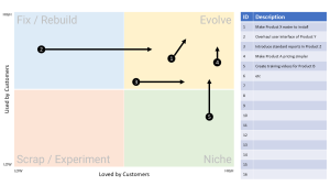
Let’s consider the 911 and Office Principles in a more visual way. We can use the following 2×2 matrix to evaluate what to renovate, replace, remove is :

Axes on the 2×2 Matrix:
X-axis = How much is it loved (customer satisfaction, NPS, sentiment, etc)
Y-axis = How much is it used (frequency, adoption, reliance, value generated, etc)
Quadrants:
High Loved, High Used ? Evolve like Porsche 911
High Used, Low Loved ? Fix or Rebuild
Painful but unavoidable workflows (e.g. clunky fulfilment screens, clumsy billing disputes, many fallouts, SLA breaches)
Perfect candidates for radical redesign with modern tools
Low Used, High Loved ? Niche or Strategic Bet
Features that a small set of customers adore but most ignore
Decide whether to promote them into wider usage, or keep as boutique value-adds such as plug-in modules
Low Used, Low Loved ? Scrap or Experiment (Office Principle)

.
.
Lindy tells us what lasts; the long tail tells us what to cut; the Porsche 911 shows us how customer love can lead to evolve the loved core without losing identity.
Rebuilding and renovating, rather than novelty addition, is how an OSS/BSS stack can get simpler and stronger with age.
In Article 4 we shift from blueprint to a key operating principle: how to design for Year 10, not Day 1.
We’ll:
.
The 2×2 matrix is mostly used in a subjective manner.
However, we can actually make it quantitative too (but this requires a bit of work).
For example,
For the “used” axes, we can measure the number of flows or transactions or even the number of times a certain branch of code is invoked if we have suitable logging mechanisms. Note that this is possibly like the y-axis on the long-tail graph where the y number is whatever you choose “value” to mean (eg volume of transactions). We could even change the “used” axis to “value generated” so that we can measure other factors like revenue generated, fall-outs occurring, orders breaching SLA, etc, etc
For the “loved” axes we can use a couple of different approaches. A user survey, a “rate this function” box within the app, or potentially a proxy example such as the number of support calls (or lack of) for a particular function

Are you worried that your OSS/BSS stack, or parts of it, might be in desperate need of an overhaul? Many OSS experts love being archaeologists,

The story of Berkshire Hathaway is a famous one. It started in textiles but Warren Buffett chose to drastically change strategy because the textiles industry

Most OSS/BSS roadmaps today overflow with novelty and buzz. You might even hear the words Agentic AI come up (not that I have anything against
After a major outage, we conduct PIRs (Post Incident Reviews). If we find something, we usually add controls. But when you think about it, that’s