Our Latest Product Release – Telecom Product & Service Mapping Guide
Every carrier knows it needs a clear product catalogue, with well-defined service and resource definitions. But it is not always obvious where to start. Across
As the title suggests, this is the second part in a series describing a process flow visualisation, optimisation and decision support methodology that uses simple log data as input.
Yesterday’s post, part 1 in the series, showed the visualisation aspect in the form of a Sankey flow diagram.

This visualisation is exciting because it shows how your processes are actually flowing (or not), as opposed to the theoretical process diagrams that are laboriously created by BAs in conjunction with SMEs. It also shows which branches in the flow are actually being utilised and where inefficiencies are appearing (and are therefore optimisation targets).
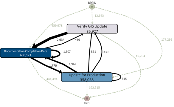
Some people have wondered how simple activity logs can be used to show the Sankey diagrams. Hopefully the diagram below helps to describe this. You scan the log data looking for variants / patterns of flows and overlay those onto a map of decision states (DPs). In the diagram above, there are only 3 DPs, but 303 different variants (sounds implausible, but there are many variants that do multiple loops through the 3 states and are therefore considered to be a different variant).

The numbers / weightings you see on the Sankey diagram are the number* of instances (of a single flow type) that have transitioned between two DPs / states.
* Note that this is not the same as the count value that appears in the Weightings table. We’ll get to that in tomorrow’s post when we describe how to use the weightings data for decision support.

Every carrier knows it needs a clear product catalogue, with well-defined service and resource definitions. But it is not always obvious where to start. Across

After reading the book, How Big Things Get Done (by Bent Flyvbjerg and Dan Gardner) about why megaprojects fail, I found it fascinating that it
I have a really important question for you to ask yourself today. It’s a question that shapes a lot of our thinking about how I
I would have heard the phrase “your network is your net worth” early in my career and probably nodded along without really believing it (or