Is telco facing a skills shortage… or a prestige shortage?
Telco keeps talking about being scared of an imminent skills cliff. But perhaps the real problem is not just that experienced people are leaving. It’s
“The far-reaching impact of the technology revolution of 2007 with the launch of the Apple iPhone is not to be underestimated. Across every industry, Apple has had a profound influence through the psychological effect of how consumers expect technology to interact with them. People now expect good design as part of their visual communication and interactivity with information. In obsessing over simple, intuitive design, Apple sets a new standard for visual communication. It was necessary to design a completely original visualization experience because when converting from the real estate of a computer monitor to a 3.5-inch screen, smart choices must be made to effectively communicate visually and create intuitive interaction with the device. Not that Apple has always done this perfectly, but it has always focused on aesthetics and the user experience.”
Lindy Ryan in the book, “The Visual Imperative: Creating a Visual Culture of Data Discovery.”
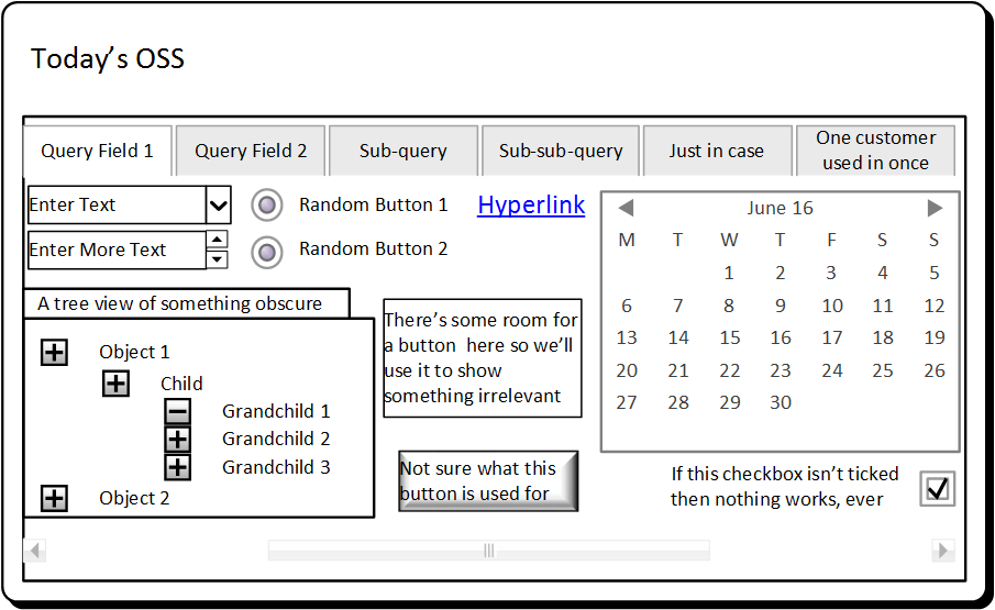
Great point by Lindy Ryan above, but I’d probably suggest that Apple re-set consumer expectations about 5 years earlier with the iPod. Anyway, here’s what a typical OSS looks like today:

Not exactly clean and elegant. Go on. Tell me it’s not true? How many OSS have you used that have a User Interface as cluttered and un-intuitive as the tongue-in-cheek sample shown above?
What if we took the perspective of having to design our OSS for a 3.5″ screen? Would we have to simplify? Would we have to reduce the design and workflows down to their very essence?
Humour me. Just as an experiment, what happens if you set exactly this task to your OSS UI designers (do you even have UI / UX designers or just devs)? Then ask them to expand any learnings back out to the full-sized monitors. I’d love to hear what you come back with.
Put it this way, I’m doubting the designs will be worse.
Telco keeps talking about being scared of an imminent skills cliff. But perhaps the real problem is not just that experienced people are leaving. It’s

Phone books now look like a relic from another era. Stone. Cold. Dead. But they were once one of the most powerful business growth engines

The old proverb above really resonates. I love this industry. You could even say I’m Passionate About OSS. And like many of us, I’ve been

Every carrier knows it needs a clear product catalogue, with well-defined service and resource definitions. But it is not always obvious where to start. Across