


When is an OOTB OSS Not Really Out of the Box?
When it comes to OSS, the term Out of the Box (or OOTB) can be correct, incorrect and highly confusing all at the same time.
OSS tools have always been built by engineers for engineers. Engineers who love to show off their brilliant minds via layers of depth and complexity.
But the new generation of users has no patience for this. Nor do their team-leaders.
This article explores what we can learn from OSS/BSS user interfaces (UI) that are more analogous to children’s books than thousand-page technical manuals.
.
OSS interfaces were traditionally built for users who were either engineers themselves or were serving cadetships on a clear pathway to becoming engineers. These were the kind of operators who took pride in mastering the command line and understanding every configuration parameter. They took pride in being one of the select few who had learnt the sophisticated ins and outs of the system through repetition, documentation and tribal knowledge.
That worked in an era when operational teams were composed of “lifers” – career-long telco specialists whose average time-on-platform could stretch to decades. But that model is disappearing as fast as the concept of telcos running cadetship programs.
Today’s coal-face is staffed by a new generation of users: contact centre agents, field technicians, customer support specialists and NOC operators who might only plan to spend a few months to a few years in their role. They come from diverse backgrounds and industries. Most are expected to onboard quickly and contribute immediately. They aren’t given the luxury of deep training cycles or trial-by-fire familiarisation. Three year cadetships have been replaced by 2-3 week training courses.
Today’s front-line worker pools are digital natives. Their daily UX baseline is set by tools like YouTube, Slack, Spotify, Canva and Instagram – platforms that prioritise clarity, minimalism, intuitiveness and instant usability. So when they encounter an OSS that looks like a throwback with dense forms, nested menus, specialised knowledge and opaque terminology, it doesn’t feel usable, let alone powerful. It just feels clunky, if not broken.
This new reality demands a new design philosophy. OSS tools can no longer assume deep domain expertise or long-term user investment. They must cater to part-time users, short-tenure employees and people with more generalist tech backgrounds. Backgrounds outside the telco rather than having been carefully curated within the telco’s walls since the first day of their careers. And that means delivering clarity, speed, and confidence without requiring a hundred-page manual to get started.
.
The reality is that most OSS buyers and users do judge the book by its cover, especially in their early contacts with it.
Consider the difference between two iconic books published 100 years apart – War and Peace and The Very Hungry Caterpillar.
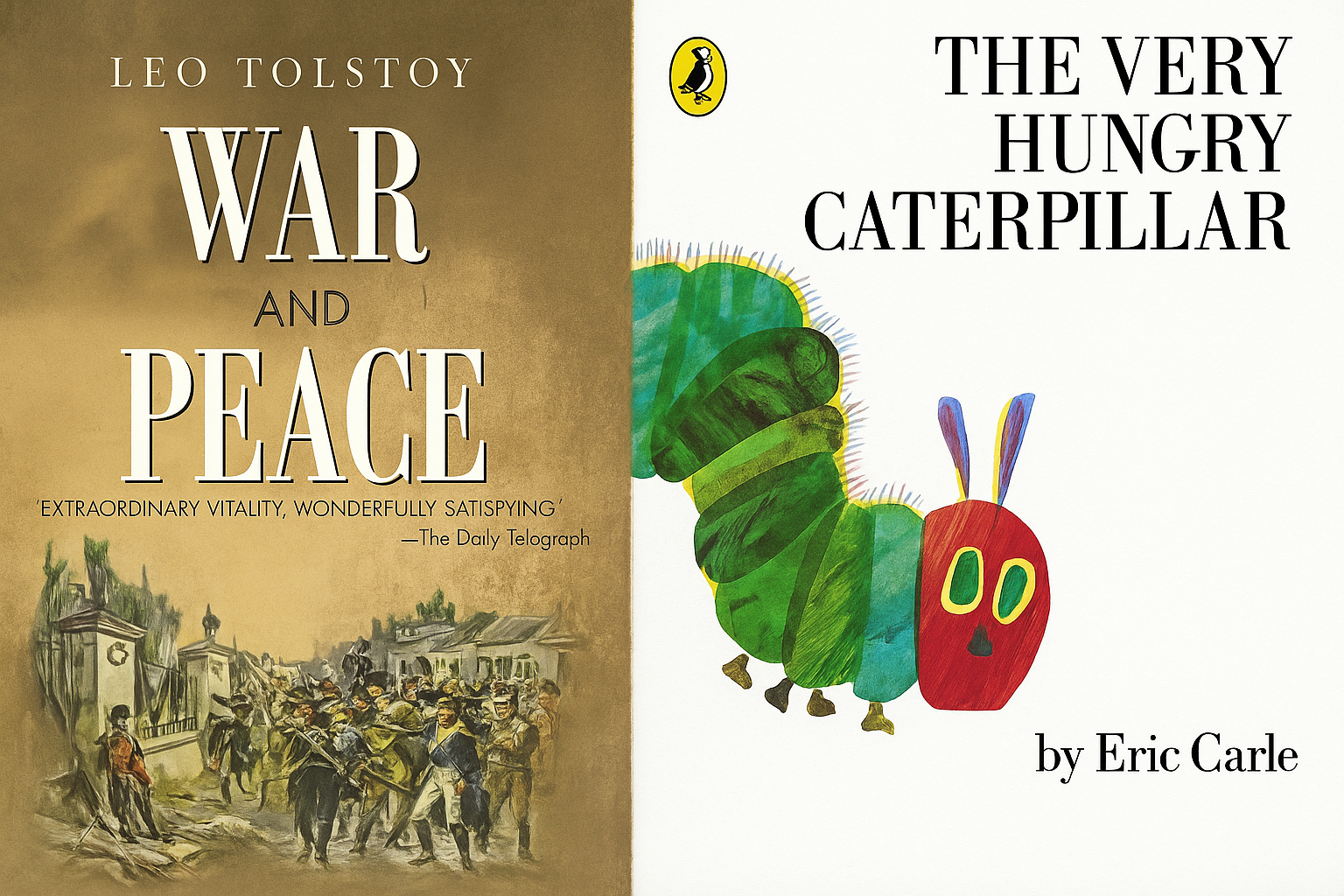
Today’s OSS users generally aren’t looking for depth by default. They’re looking for direction and speed of resolution. Not only that, they’re often evaluated by and incentivised for speed of resolution.
This demand for simplicity isn’t just about daily usability. It’s now reshaping how OSS vendors compete in the market. In procurement processes, buyers are no longer just asking about functionality. They’re assessing how easy that functionality is to access and action. During “OSS procurement events, I’ve seen first-hand that buyers can judge the book by the cover“
Your UI isn’t just part of the user experience anymore. It’s also part of the sales experience.
When your product demo opens with a 12-tab dashboard, a forest of icons and an interface that looks like it hasn’t changed since 2010, the message is clear: complexity and legacy thrives here. For the modern buyer, and in a situation when many products are functionally comparable, the UI/UX/CX is often a dealbreaker.
This doesn’t mean dumbing down. It means designing for intuitiveness. It means creating visual story-arcs that help guide users through what matters most. It means hiding advanced options behind intuitive drill-downs, not putting them on a highly cluttered first screen. It means making sure your system tells a “fat caterpillar” story – clearly, visually and fast.
As a moving average, we’re transitioning from blue to red on the book axis of OSS complexity below.
![]()
I’m also not suggesting that all of today’s OSS users are at the left end of the continuum. Far from it! There are still plenty who expect the deep character development and plot-line of a War and Peace from their OSS. It’s just that fewer are being given the time to really dig into the details anymore.
OSS doesn’t need to lose its sophistication. I’m not suggesting they should be dumbed-down by any means. The complexity needs to be hidden, but the nuanced sophistication must be surfaced with great care.
.
For decades, OSS required extensive prior knowledge even before you spent ages learning how to use them. It was assumed that deep technical knowledge, extensive onboarding and even weeks of shadowing were part of the job. I certainly spent many weeks before the dots started to connect on my first OSS project (if I’m being honest, the dots are still connecting today). Careful consumption of long manuals were a badge of honour. Training programs were expected and learning complex workflows were seen as unavoidable.
But today’s OSS users don’t want to be trained. They want to be productive.
In a world saturated with apps that guide users intuitively, most OSS has been left behind. What makes it worse is that these same users are moving seamlessly between beautifully designed tools in their personal lives and suddenly being dropped into environments that feel like they were built for a different century (the product cores of some OSS were built last century). The contrast is jarring.
Modern OSS must be built with the assumption that no one will read the manual. Not because users are lazy, but because modern UX norms have changed expectations and bosses expect greater speed of work.
This is where self-explanatory design becomes a critical capability. It’s not about dumbing down interfaces. And it’s not just about the UI. The User Experience / Customer Experience (UX/CX) extends beyond the UI. It’s our responsibility to reduce friction at every step. Smart defaults. Clear visual hierarchy. Predictable interactions. Easy installation. Easily understood pricing models, etc, etc.

And just as importantly, the design must adapt to the user’s role and context. I’m really big on UIs being designed for each persona. A contact centre agent doesn’t need the same view as a network planner. A field technician shouldn’t see what an OSS architect sees. When everything is shown to everyone, no one gets what they need.
The ideal OSS interface acts like a silent mentor: always guiding along each step of the process, just like the Very Hungry Caterpillar. It tells the user: you’re in the right place, here’s what to do next.
This shift has organisational impact too. If your UI is doing its job, you don’t just reduce training time. You also:
In short, you move from relying on people to learn your tool to designing a tool that understands and caters to all varieties of people.
.
We’ve all seen the Frankenstein Effect alive and well in the world of OSS. We’ve possibly even contributed to it (I know I must hang my head in shame here!). This is where extra parts (features, menus, pop-up boxes, etc) are just tacked on to the existing UI wherever is easiest without thinking of the impact to overall CX (Customer Experience).
One of the most common myths in the OSS space is that improving user experience requires throwing out the old system and starting again. In some cases it does, but for vendors with decade-old platforms, or CSPs with years of embedded configuration and customisation, that idea feels risky, expensive and unrealistic.
But modernising UX doesn’t mean rebuilding OSS from the ground up. It means reframing how you think about the interface as a distinct layer of value. OSS platforms are often extremely capable under the hood; it’s the presentation layer that’s holding them back. In fact, as LLMs start to replace baked-in paradigms in the business logic layer, the presentation and data layers take on even greater importance.

Refactoring, in this context, doesn’t mean rewriting core logic. It means creating a better conversation between the system and the user.
That can be achieved in several ways:
Abstraction layers: Wrap complex workflows in guided experiences that expose only the necessary inputs for a given user role
Task-centric redesign: Instead of mirroring system architecture or back-end data models in the UI, design around what users are trying to accomplish
Role-based views: Surface only the relevant data and controls for specific personas. Think of the different speeds of action for each role too. Fault-fix engineers want details and cross-referencing to solve gnarly root-causes. Agents want speed and clarity, partly due to volumes but also for better customer experience. Both speeds should get what they need
API-first and data-first design: With many legacy OSS now exposing API layers, there’s an opportunity to build modern, responsive UIs on top of robust but aged infrastructure, effectively breathing new life into old systems
But the UX transformation is a horses-for-courses decision. You don’t always need a “big bang” UX overhaul. Sometimes it could be a parallel build. Sometimes it could be a strangler fig transformation. Other times it could be a staged evolution. You can start small: redesign a high-friction workflow, simplify a frequently used screen, introduce a context-aware dashboard or support function. I’ve heard from UI/UX specialists is the key is to not just take the first design, but to take the time to compare multiple layouts, then test, learn, iterate.
There’s a distinct mindset shift required for the OSS world. From “our users will figure it out” to “our system should make it obvious.”
The starting point of this mindset shift is to separate the function of development and UI design. One’s left-brain, the other’s right-brain. I can probably count on one hand the number of OSS product experts I’ve met who can do both skillfully.
.
There are two tangible measures great UI: speed and intuitiveness.
The time it takes to onboard new staff into operational roles is a cost and poor UX is a multiplier. Long onboarding cycles just aren’t an option anymore, especially in typically high-churn teams.
Almost all frontline environments such as contact centres, NOCs and provisioning teams, experience frequent staff turnover, shorter KPI targets and tighter margins. Every additional week a new hire takes to ramp up is a week of reduced productivity, increased supervisory overhead and potential service impact. In this context, user experience is no longer a “nice to have.” It’s a business-critical function.
When systems are hard to use, errors rise, tickets backlog, and support becomes a constant overhead. But when UI is built with intuitive flows and clear affordances, onboarding becomes embedded into the product experience itself. New starters can self-guide.
Modern OSS UX must turn the platform itself into a guided training engine (this is where AR/VR hold great promise for OSS of today and the future BTW).
A good interface isn’t just a productivity tool. It’s a retention tool. It’s a recruitment tool. And increasingly, it’s a revenue tool.
If your OSS still looks and feels like War and Peace, it might be time to start rewriting chapters. Because few of the new generation will be bothered to read half a million words to find their answer.
