Most OSS/BSS roadmaps today overflow with novelty and buzz. You might even hear the words Agentic AI come up (not that I have anything against it but it can be a little over-hyped at times).
But this series has taken a different path. We’ve looked at how to build a model that looks for enduring benefits that really move the needle today (and will continue to into the future). In the previous articles, we’ve used the Lindy Effect, complexity reduction, and activity prioritisation techniques. In Part 4 we pull it all together into a practical, repeatable dashboard you can use on your long-term plans as well as during every release cycle.
Series Recap:
Part 1 leverages the Lindy Effect to look at what use-cases have endured for the last 40 years to predict 10 years ahead. It also uses the concept of the long tail to highlight what to prioritise next.
Part 2 treated incidents as audits to help identify layers of complexity that could be eliminated or reduced so that future changes get easier.
Part 3 applied analogies to the enduring silhouette of the Porsche 911 and evolutions of Microsoft Office to the world of OSS/BSS Roadmaps. It also introduced a 2×2 matrix with used × loved as the two axes to help decide what to prioritise. This also introduced 4 prioritisation and next-step action classifications of
- Evolve
- Fix/Rebuild
- Niche, and
- Scrap/Experiment
When combined, all of those pieces now consolidate into a single evaluation model:
- Lindy + 10-year prediction – identify what has remained constant and will therefore likely continue to endure
- Complexity reduction – diagnose and remove clutter using the 13 Friction Continuums as a guide
- Long tail focus – double down on what moves the needle and starve features that don’t
- 2×2 matrix (used × loved) – choose what to work on next and what steps to take
- Roadmap scorecard – turn gaps into actions, owners, and measurable improvements in long-term plans and in each release
How to use each of the 5 pieces
1) Lindy + 10-year prediction – Start by naming the functions that outlast hype. At the highest levels, that’s still Inventory, Fulfilment, Assurance, and Billing. But many of the use-cases within these domains also endure. These are the starting use-cases of any new iteration or MVP version of an OSS/BSS product. These are your “land plots” where rebuilding pays off.

There’s no coincidence that these are the four arrows that sit on top of the Simplified TAM model either.
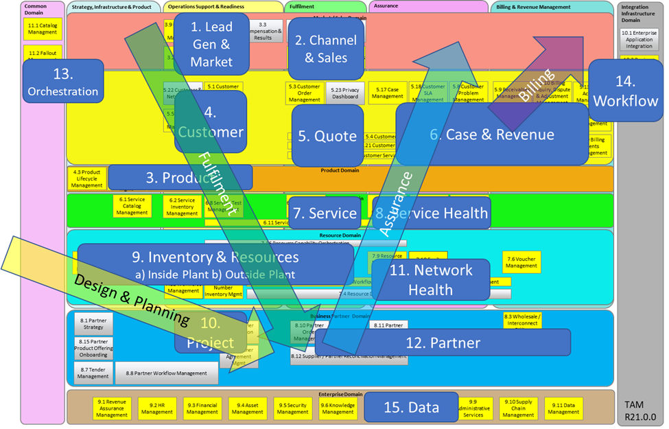
These are the Lindy-stable shapes of OSS/BSS (not to mention their dozens of associated perpetual use-cases).

When designing a product roadmap, most backlogs naturally drift rightwards on the long tail (the blue arrow) because the red band already exists. Therefore, it’s in the blue arrow where we conceptualise features that have never been seen before and where we find new, niche problems to solve.
The red band is the Lindy functionality. It’s the core capability that has probably existed since the MVP version. That’s because it’s also the highest value functionality.
Refer back to part 1 of this series for a set of steps to encode your version of the long-tail diagram above.
Refresh this list annually.
2) Complexity reduction with the Friction Continuums – Measure today’s usability/usefulness across 13 scales in the diagram below:

Each has a left-to-right scale from painful to excellent. Score where you are today and where you want to be next release. We can score individual functionalities (from the x-axis of the long-tail diagram) against these 13 friction measures.
3) Long tail focus – Compare the feature requests in your backlog against the long tail. If something sits far to the right (in the blue arrow) and doesn’t enhance your most important workflows (eg time-to-cash, MTTR or adoption, etc) put it on the “tail kill” or down-prioritised list. Savings here fund the improvements that matter and reduce your overall TCO (total cost of ownership) over the lifetime of the product.
4) The 2×2 matrix – Place products, modules, or workflows on the 2 x 2 matrix below.

Use real adoption and customer satisfaction / sentiment data, not hunches, to identify what capability to work on next.
The following version of the diagram provides further descriptions about what to do with functionality that falls into each of these 4 categories.

5) The roadmap scorecard – For each planning exercise and/or release phase, map each initiative under consideration into the roadmap

Note that the table on the right side of the image is a simplified version. It’s likely to have many other columns, including initiative description, system / interface name, quadrant, 13 friction scores, tracking status, current / future usage metric, current / future “love” metric, results observed, etc, etc.
Build the Roadmap Scorecard
Think of the 2×2 as your “what” view and the overlay against the 13 continuums as your “how” view. We combine them into a single heat-map that converts scores into action.
- List initiatives and give each an ID – We start off by creating a list of initiatives. This could be an Agile backlog or similar. (eg initiatives 1 to 5 in the table above)
- Place each ID marker (numbered black circle) on the 2×2 plot – based on its customer sentiment (love) and usage-level scores
- Score friction today vs target – for every ID, every initiative, indicate which one or more of the 13 friction continuums will be improved by the initiative (eg initiative #1 aims to make Product X easier to install). Evidence is recommended: screenshots of install steps, timings, logs, user videos, tickets. Set a target score for the next release
- Translate friction gaps into actions – tie each to the continuum it improves. For example:
- Installation – cut steps from 8 to 3, auto-detect prerequisites, provide sample configs
- User interface – reduce clicks by 40% for task X, standardise patterns, improve empty-state guidance
- Data ingestion – shrink mapping time from 3 days to 4 hours; add schema validators, add cross-domain discovery stitching
- Training/materials – produce short, task-based videos and a starter dataset; add a “learn mode” with in-product tips
- Support – open a multi-channel help path; add playbooks and known-issue findability.
- etc
- Create the arrows – arrows show the amount of expected improvement as a result of each initiative (ie “today -> target”). That arrow is your public promise of improvement. The biggest impacts stand out via the longest arrows
- Use the scorecard to measure improvements every release – make the scorecard your operating rhythm. A fix is only “done” when the friction score improves, something unnecessary is removed, and the 2×2 arrow moves in the intended direction
- Release cadence – For each cycle:
- Pick the top 3–5 fixes using the priority score
- Deliver the actions – and remove at least one interface, product, or variant tied to the problem
- Re-score the friction scales, re-plot arrows on the 2×2, and publish KPI deltas
- Roll successful patterns into standards so improvements stick
- Re-score after each release and publish the before/after
Why the Roadmap Scorecard works
The Roadmap Scorecard aligns all of the article series’ themes in one place. Lindy tells you what lasts. The long tail prevents wasted and vanity efforts. PIR-driven simplification reduces the TCO. The 2×2 picks the items that matter and implies what to do with the initiatives that fall into each quadrant. The friction heat-map shows precisely how to make them better. The scorecard turns all of that into a systematic, transparent and quantified operating system that carries your OSS roadmap into the future, delivering the most bang for your buck.’
Drop us a note to let us know how this works for you!